Merging the traditions of Dia de los Meurtos seamlessly with a digital product.
Role
Web Design
01
Startup founders Shinu and Jacquie needed an attractive landing page to convert visitors into active users for their beta cohort. The app they're building is a virtual altar for users to honour and remember their loved ones during Dia de los Muertos and beyond from all over the world. Their previous landing page was missing some key elements: nods to a digital product, product photos showing the value of the experience, and clear-cut UX with call to actions prompting users to try out their product.
02
My top priority was bringing their visual and fun-to-use product to center stage. I needed to do this while integrating some of their existing assets, like logos, copy, and branding colours into a new and fresh design. These elements needed to be coupled with great storytelling, effortlessly leading users to create their first virtual altar!

03
Improving the UX
I started by smoothing out some usability issues. I removed a pop-up about their beta product that appeared every time the home page was reloaded and relocated that secondary information to a more appropriate spot. I also added missing CTA's to remind users of MiAltar's offering and made an input form shorter to make it easier for users to provide feedback.
Then, I collaborated with the founders to improve the readability of their content. We transformed long sections of text into a header and body format, and whenever possible, I turned information into an icon list for even more clarity.
Setting a digital product tone and integrating assets
I needed the hero section to convey that this was a digital product in ways beyond the text. The founders also had a specific idea for the hero image, and I couldn’t achieve it using stock photos. I combined both ideas and worked with Dall-e, Adobe Photoshop, and Firefly to create a digital image that captured the essence of Dia de los Muertos. This image also effectively bridged the gap between the illustration style of their logo and the rest of the new landing page design.
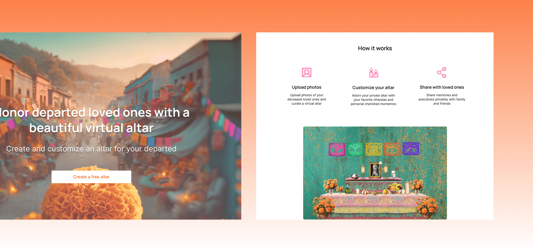
Emphasizing the product
There was only one product section in the original design and it didn’t include any photos of the product itself. The new design has two large product sections equipped with detailed lists, photos, gifs and coupling CTA’s enticing users to try it for themselves. This product is inspired by longstanding traditions of bringing people together, physically, and MiAltar is helping their users reimagine the possibilities.
04
Results
Shinu and Jacquie feel confident to ramp up their marketing efforts with the new website. The updated landing page is an important addition that fills a gap in their strategy by allowing them to lead with a better sense of their product. They aim to use the website to enhance engagement and sign-ups, to achieve a significant increase in user activity by Dia de los Muertos this October.